WETA’s Reading Rockets is a marquee resource for literacy teachers nationwide. The program’s focus is not just on helping young readers but also on how caring teachers, parents, and caregivers can support those young readers. To redesign Reading Rockets, WETA gathered a team of experts to ensure the site’s information-rich resources would be accessible and engaging for all educators.
We led the user interface and branding refresh design efforts while supporting the user experience work WETA had already started.
Services provided
- Branding
- Illustration
- User Experience Strategy
- Web Design
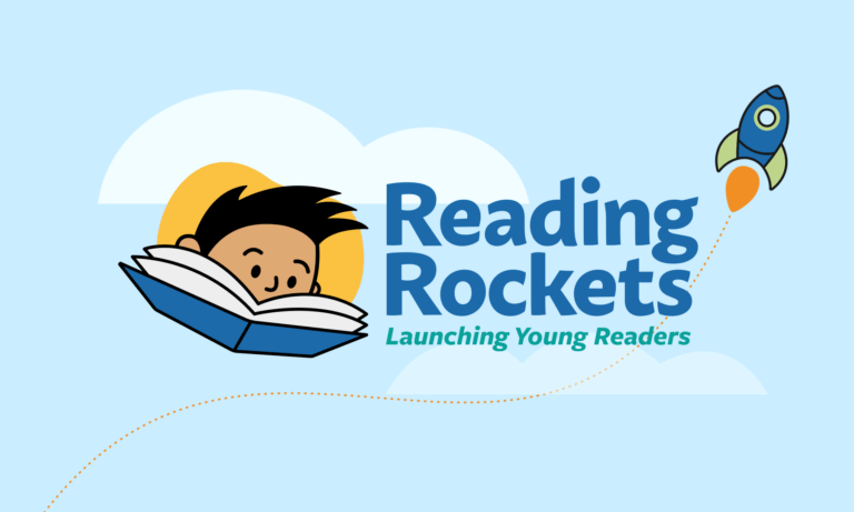
Emphasizing the joy of teaching literacy across the brand’s design
Reading Rockets is a well-respected, well-loved service for educators and parents that has been around for over 20 years. When evolving a brand like that, you must ensure it still reaches your audience. Working closely with Reading Rockets’ Senior Director Tina Chovanac — a design and UX professional and literacy education subject matter expert — we iterated through multiple color and typography choices, finding a core that felt like Reading Rockets but was also motivational and more vibrant.
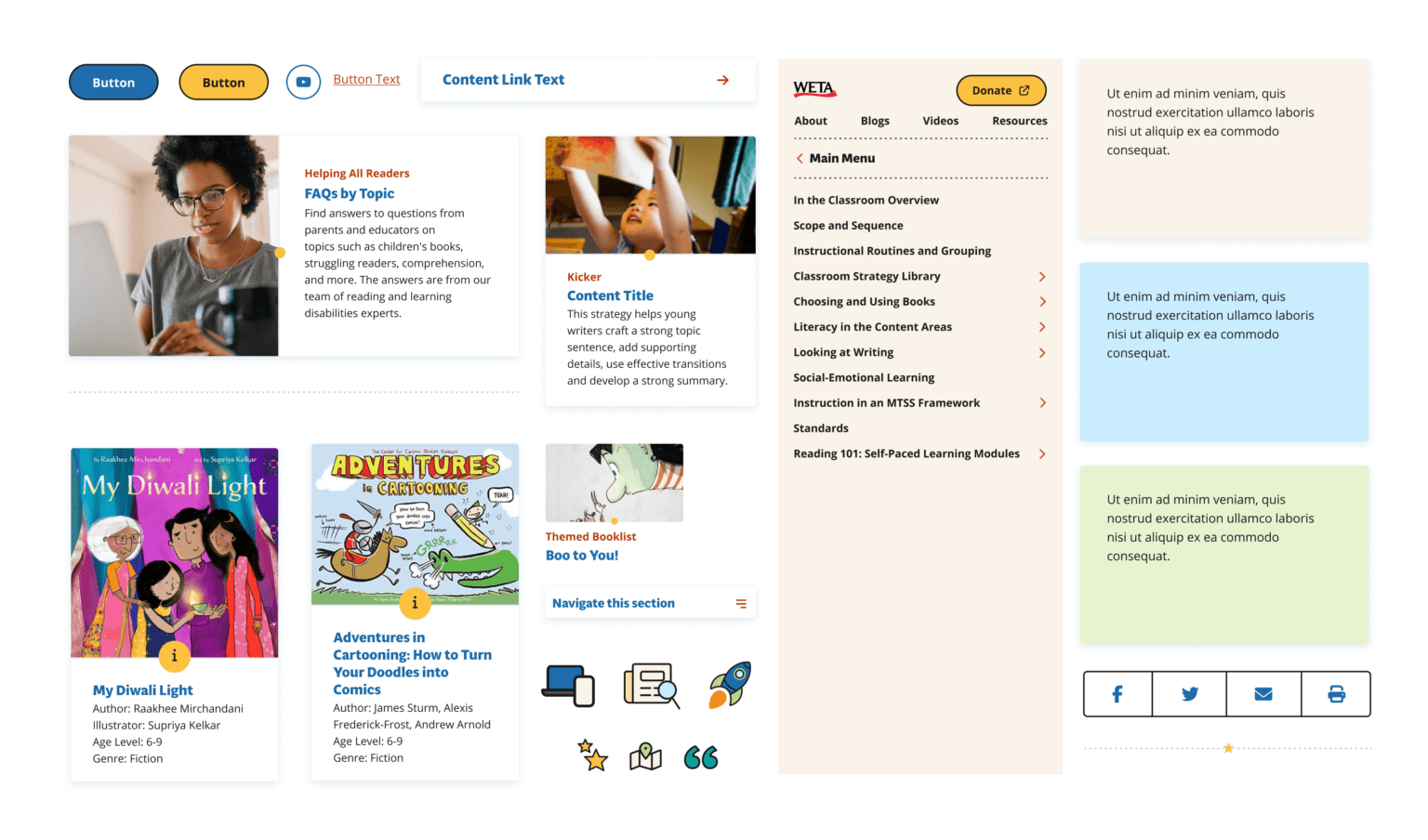
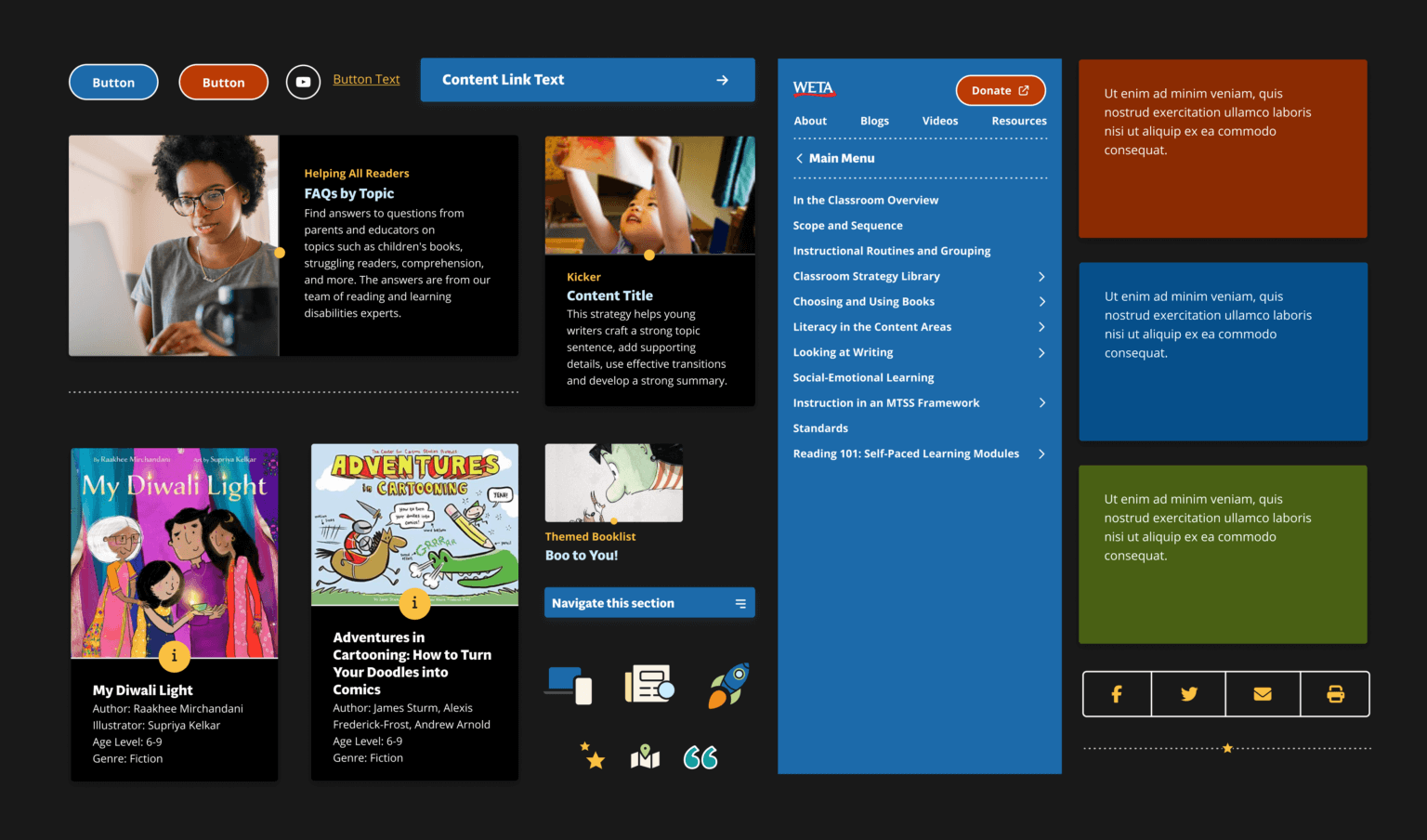
Our guiding principle was simplification. The previous logo only worked horizontally and had numerous competing elements, but it felt dynamic and engaging. We achieved the simplification we sought by centering on the reading character and moving other aspects to a supporting role. Color, shape, and form would give us the engaging energy we needed.
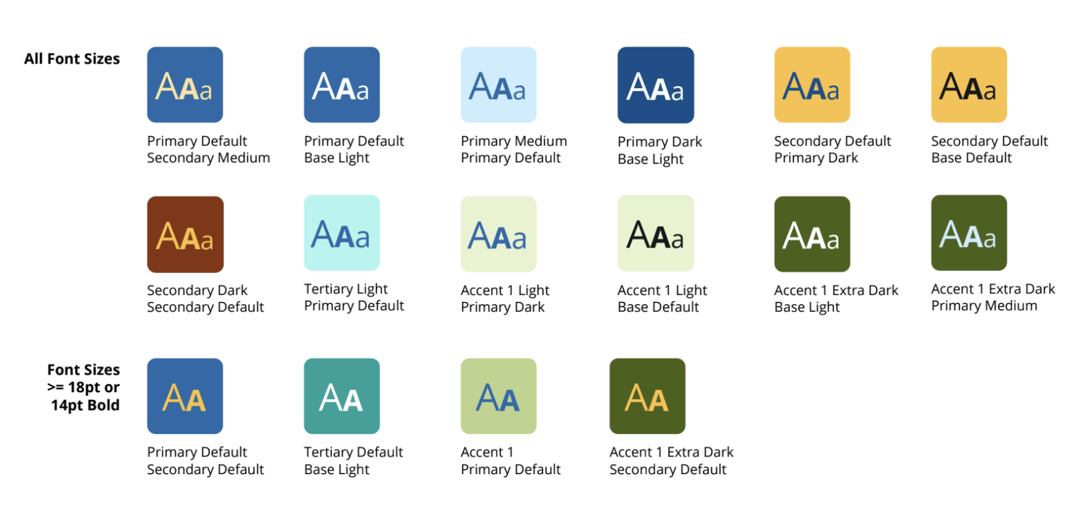
Our color palette was adapted from the original Reading Rocket palette but pulled further away from anything with too much grey in the mix. The final palette is made up of 37 colors and tones, so we selected pairings for primary use that follow WCAG AA 2.2 guidelines. It would be easy for a team to be overwhelmed with options, and it is our job to keep that from happening.
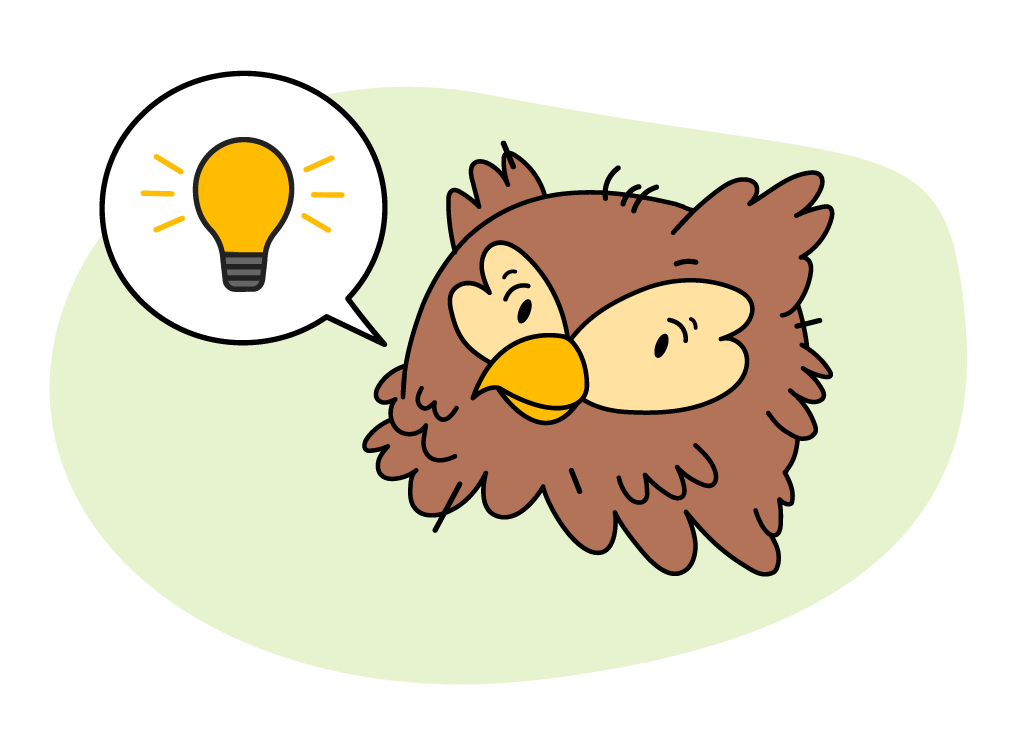
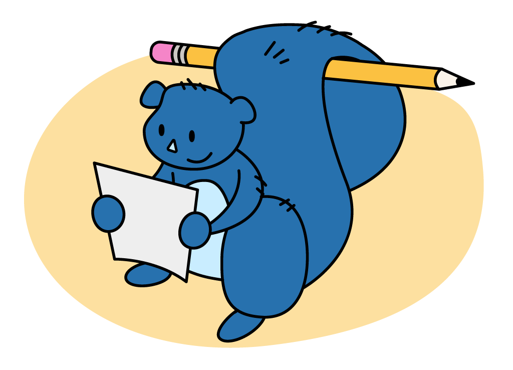
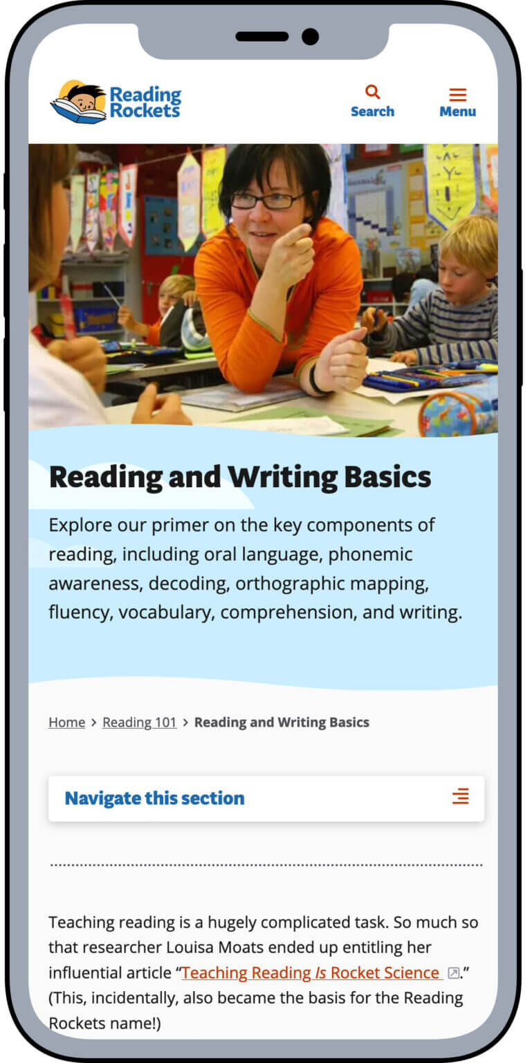
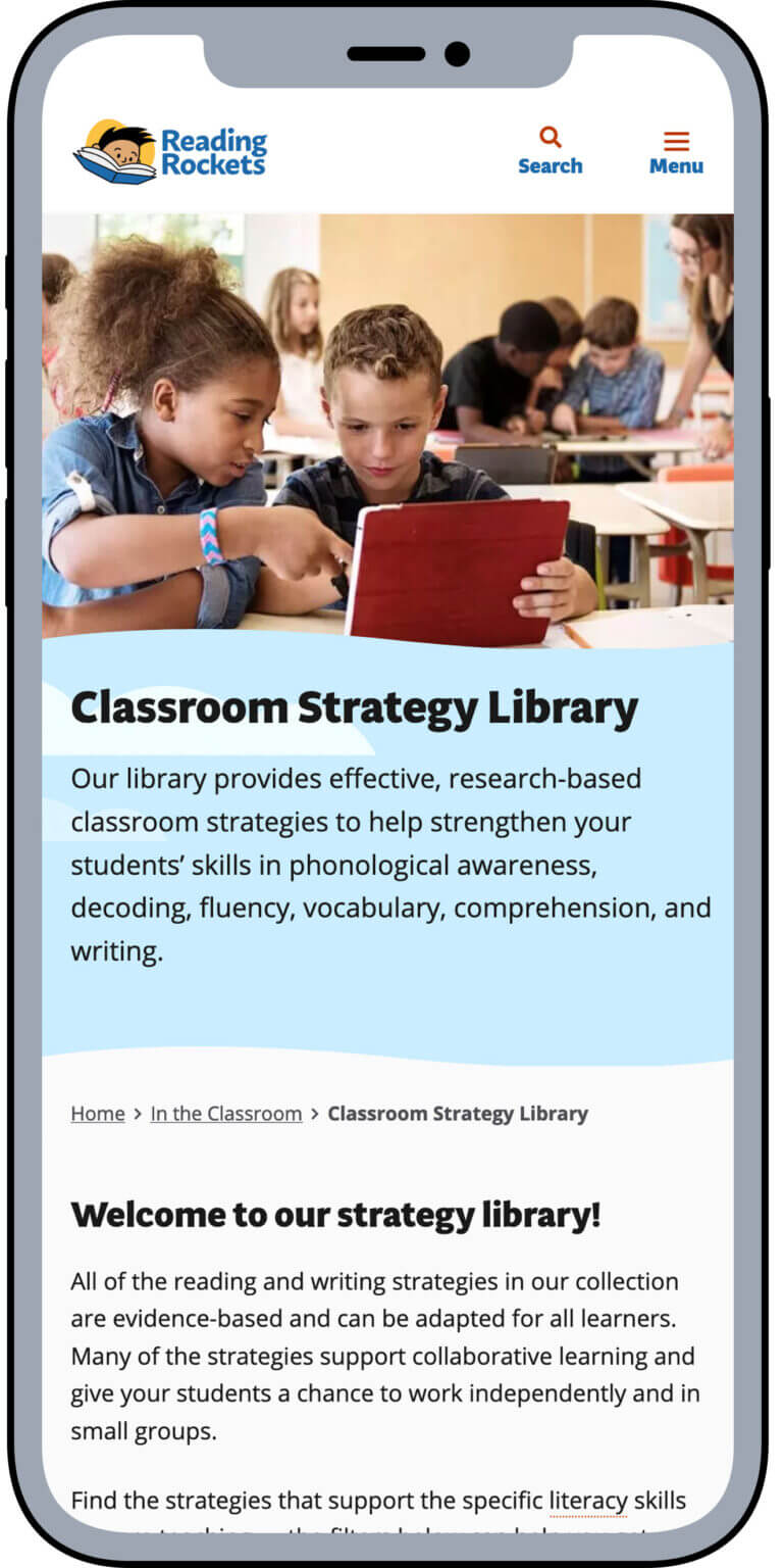
The content has beautiful supporting photography that WETA had curated and collected over the years, so they tasked us with creating supporting illustrations. We had previously worked with WETA on creating illustrations for handouts and other materials, so it was an excellent opportunity to evolve those pieces into a set of characters they could use across their channels.


This brand language visually sets the site apart from other educational support sites and helps show who Reading Rockets is as an organization. They’re here to help teachers, parents, and caregivers teach literacy, but Reading Rockets also exists to remind them that they are bringing joy to a lot of children.
Supporting a talented team of experts with our perspective
The WETA Learning Media team and their partners at the Rapid Development Group had created a responsive Drupal 9 theme that met many of their needs across Reading Rockets’ sister sites.
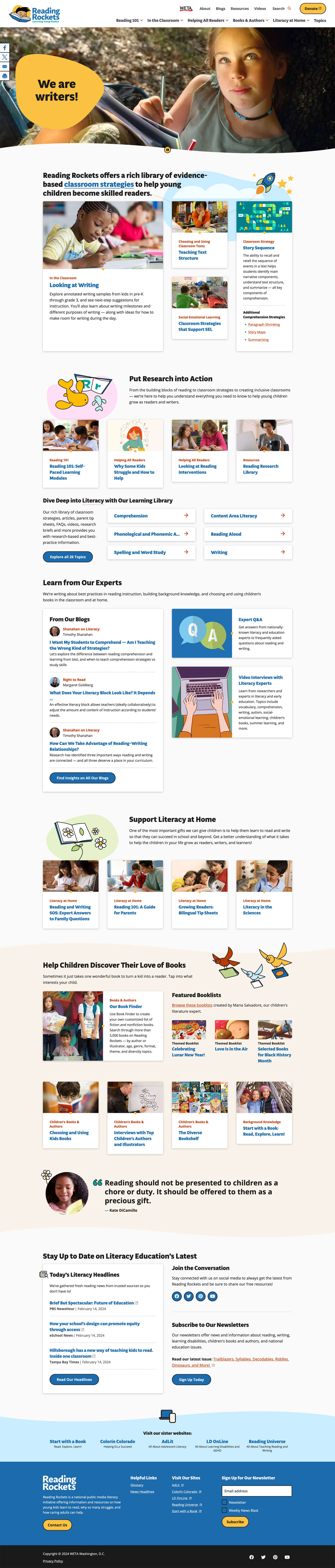
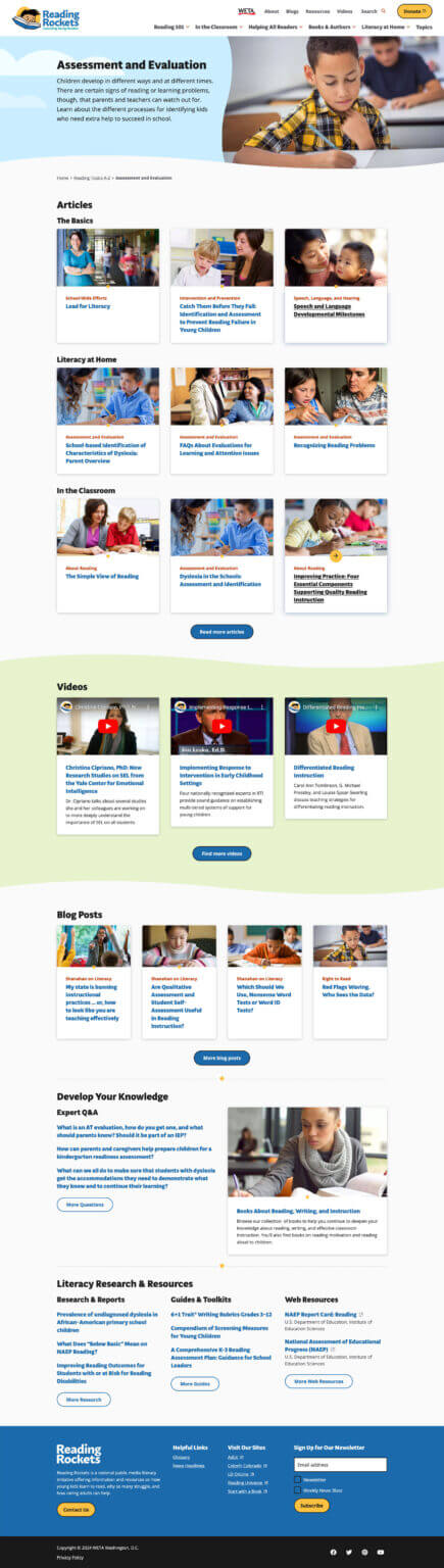
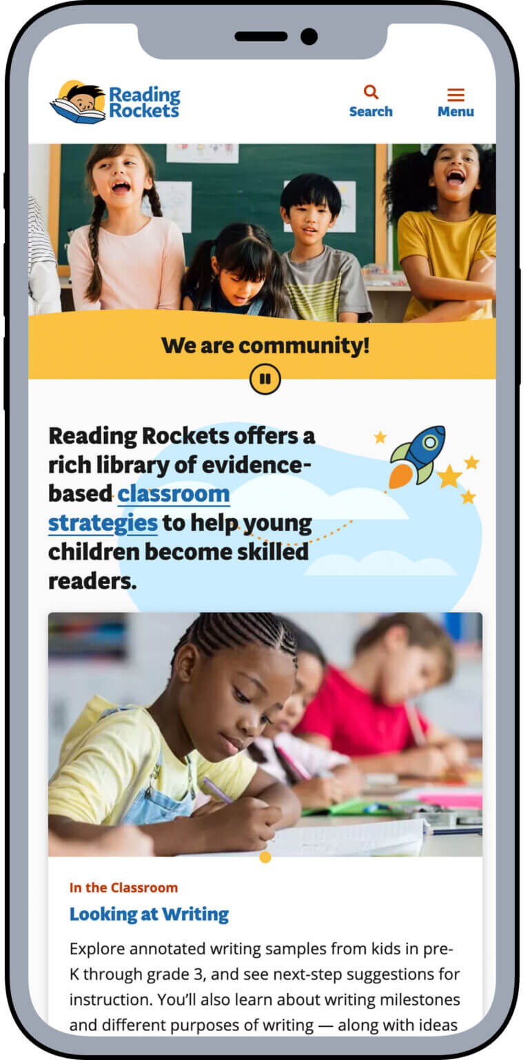
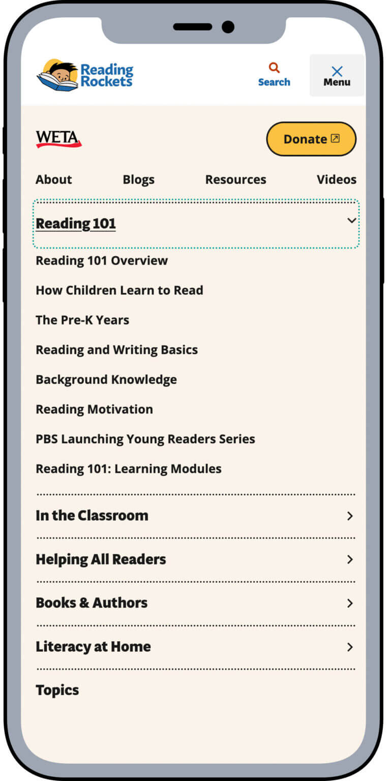
While looking at the depth of content on the Reading Rockets’ site alongside the new sitemap Tina had put together, we saw an opportunity to provide a more editorially guided experience than is commonly found on sites of this type. We wanted the site to feel more like a news site or a timely periodical rather than a service organization. That mental model would allow us to create a UX and UI solution that showed that Reading Rockets responds to teachers’ real-world needs quickly and clearly. An editor can manually select content for the landing page for each main section.
Thanks to the taxonomy work done by the WETA team and programmatically implemented by Rapid Development Group, site subpages automatically pull in relevant content so that site users can find it, but Reading Rockets team members are spared having to update every page manually. This hybrid solution fully leverages the strength of Drupal 9, providing flexibility where necessary but letting the system do what it does best elsewhere.
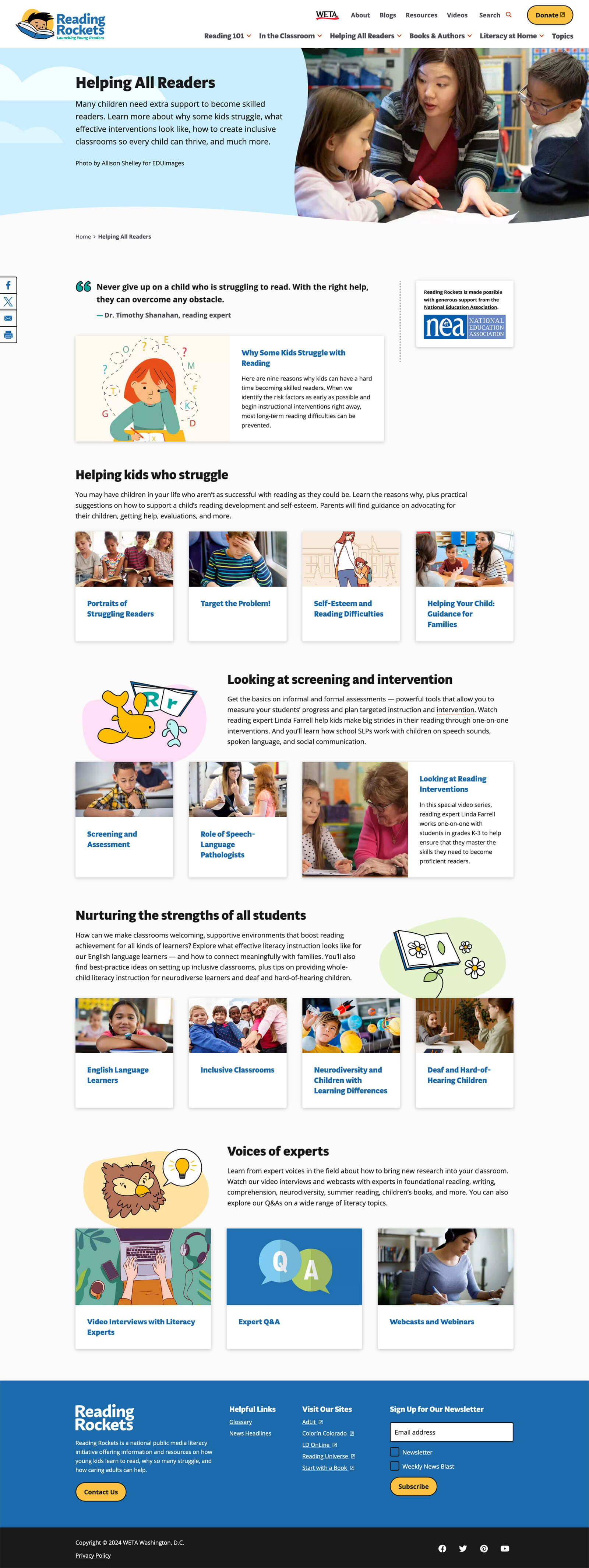
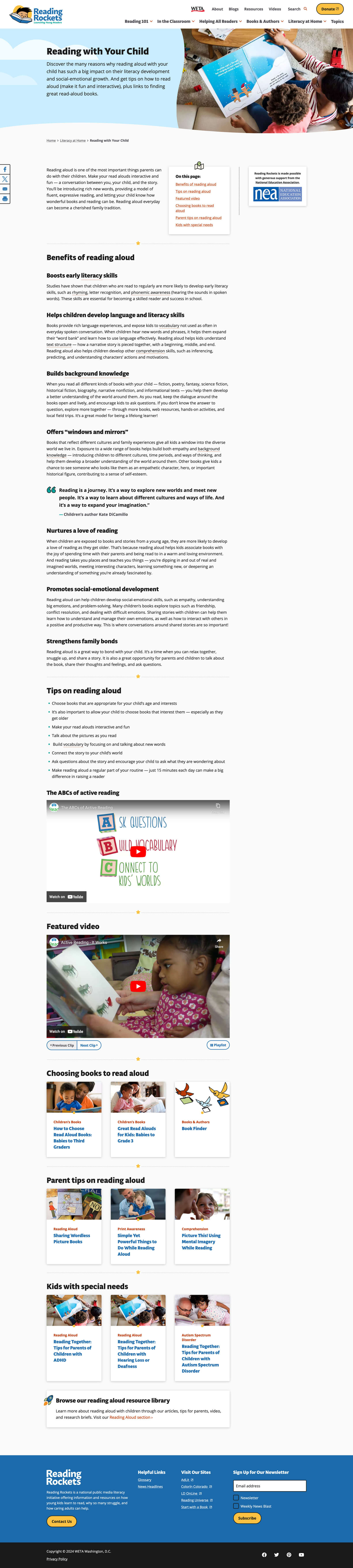
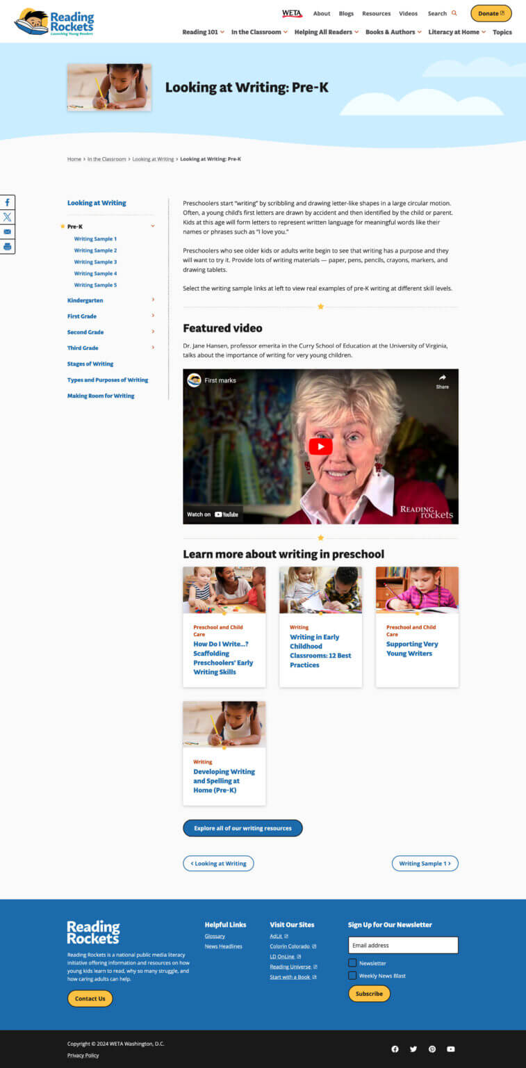
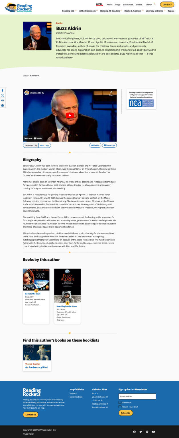
Throughout the site, we brought in our new brand elements with curves, clouds, and other illustrative touches to ensure the concept of joy was always present.
Creating a pattern library for a resource library
The existing Drupal 9 theme already had several UI elements in place. RDG supplied us with a list of what existed and why it existed early in the process. We used this list to identify gaps in the patterns that would keep content from being delivered in a way that gave the best results.
As designers, we need to be sure we aren’t burdening developers and editors with endless pattern variations. We set up a process that allowed for constant communication and collaboration, leading to new patterns that were necessary and enhancements to current patterns that met new goals. The process even helped eliminate a variation or three, streamlining the theme where possible.
RDG’s expertise in accessibility also gave us significant insight into how we could apply the new brand in an interactive way that everyone can enjoy.
Redoing a site the size and scale of Reading Rockets is no small task, especially when you add the pressure of refreshing a established, trusted brand. WETA assembled a team that enhanced each other’s skills and supported an essential program for educators everywhere. Our experience and perspective were the final piece of the puzzle the team needed and we’re proud to have been a part of it.