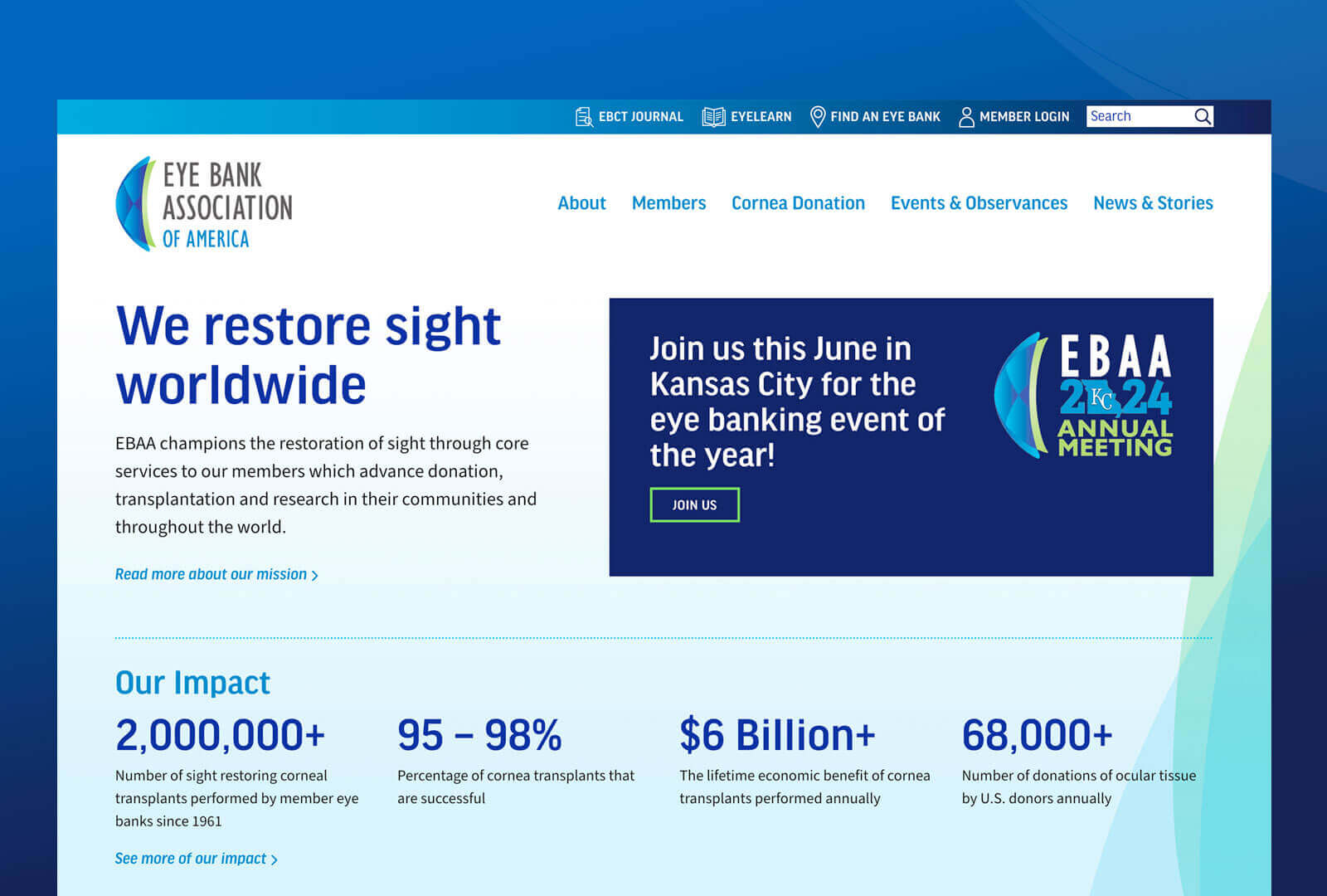
NHPCO’s content focusing on caregivers and those coping with serious illness had become difficult to find amongst the hospice partner content on nhpco.org. They began working with patient advocate Sharon Stevenson to solve this problem and we joined the team to help shape their needs into a usable, valuable experience on the Web.
Like our work with the Reflective Democracy Campaign, this collaboration utilizes all of our skills and experience here at Rocketkoi.
Services provided
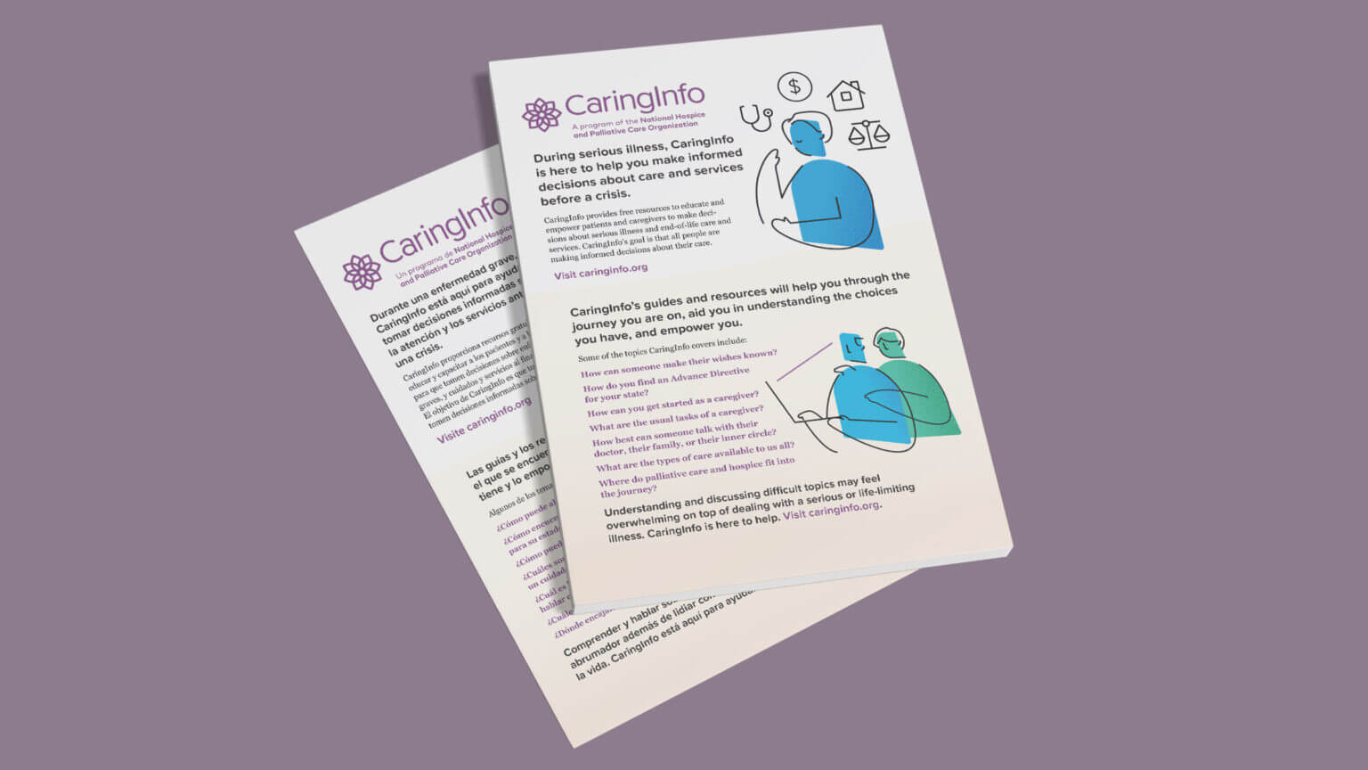
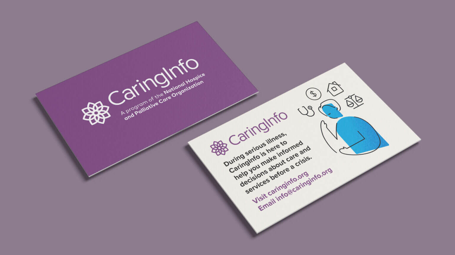
- Brand Support
- Content Strategy
- Illustration
- Print Design
- User Experience Strategy
- Web Design
- WordPress Development
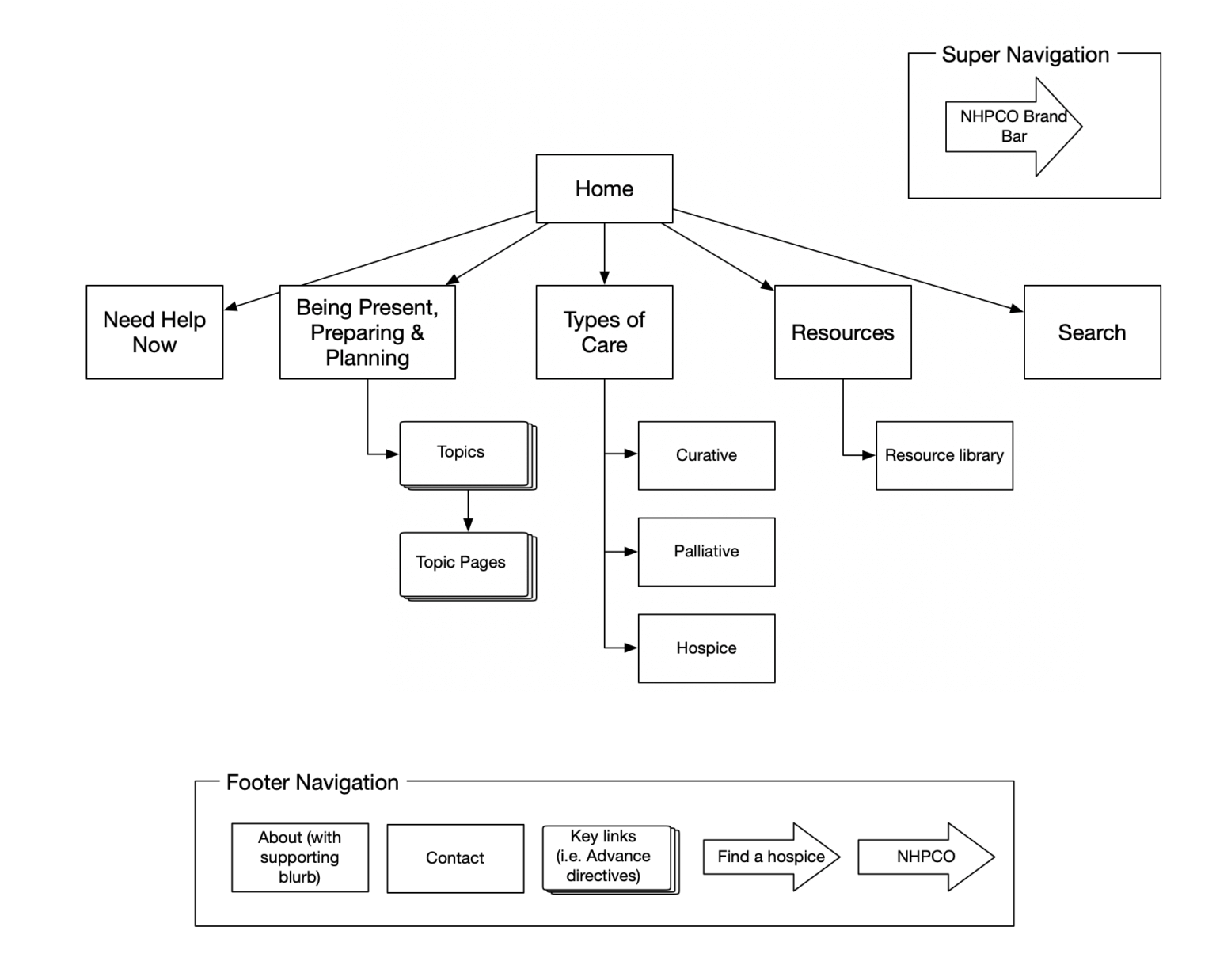
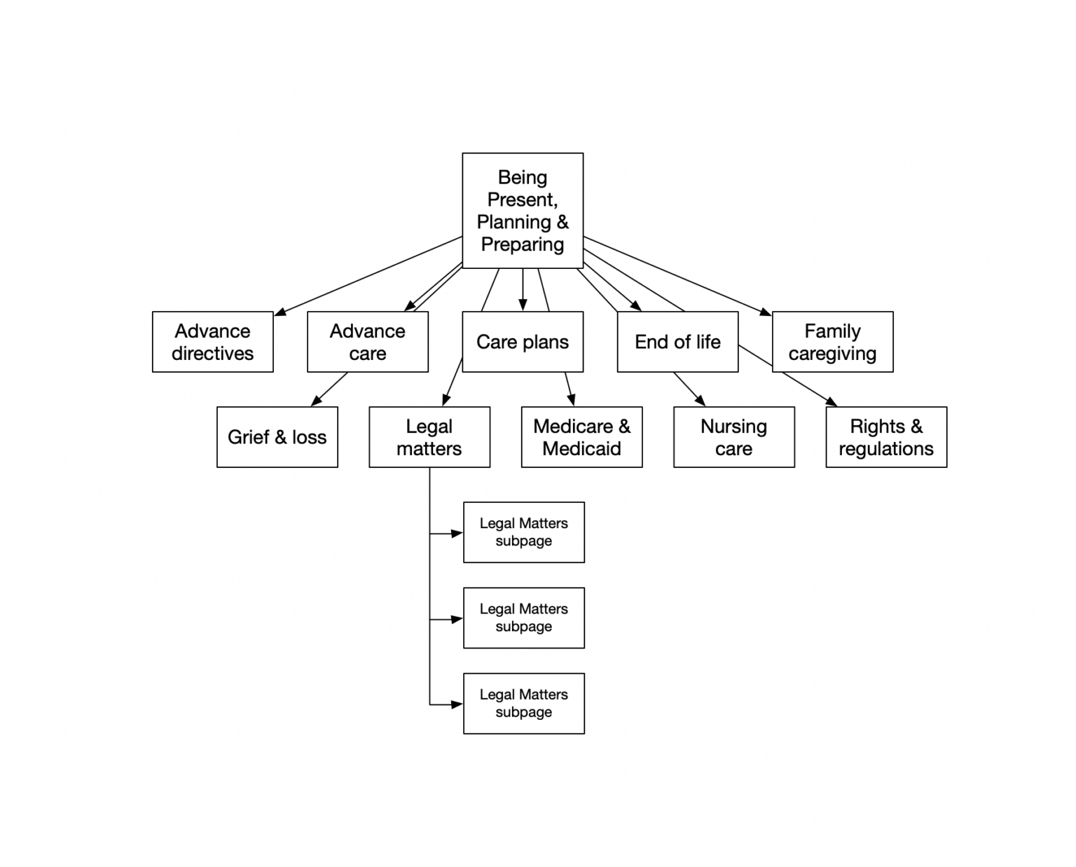
Creating a strategy that helps our audience prepare for what’s to come
The content NHPCO wanted to give caregivers and those dealing with end-of-life illnesses help with planning for tomorrow and being mindful today. We needed to ensure audiences could find the content organically and navigate the site effectively.
Orange Spark Digital’s expertise, guidance, and analytics research helped the team realize a strategy focusing on clearly answering questions around care both optimizes our content for organic search and ensures readers find their answers on caringinfo.org. By combining research-based information with anecdotal stories so that everyone feels less alone during tough times.
Putting the strategy into action
By presenting this information in a consistent, easy-to-read manner, our audiences can feel comfortable taking their time finding what they are looking for. Font-size switching and print CSS also let them read our content in a way that is the most comfortable for them. Sharon has seen a variety of needs in her work as a patient advocate, and we need to be sure we meet everyone precisely where they are when they come looking for answers.
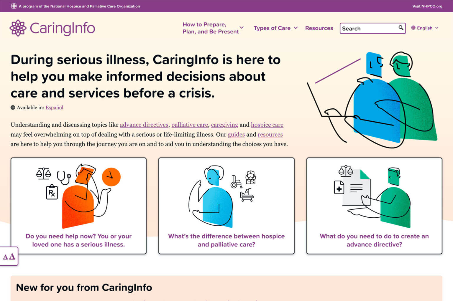
We knew the site would be text-focused and encouraged the team to embrace that. CaringInfo’s purpose is to provide information to those looking for it, so the familiar refrain of “people don’t read on the web” is ignored here.
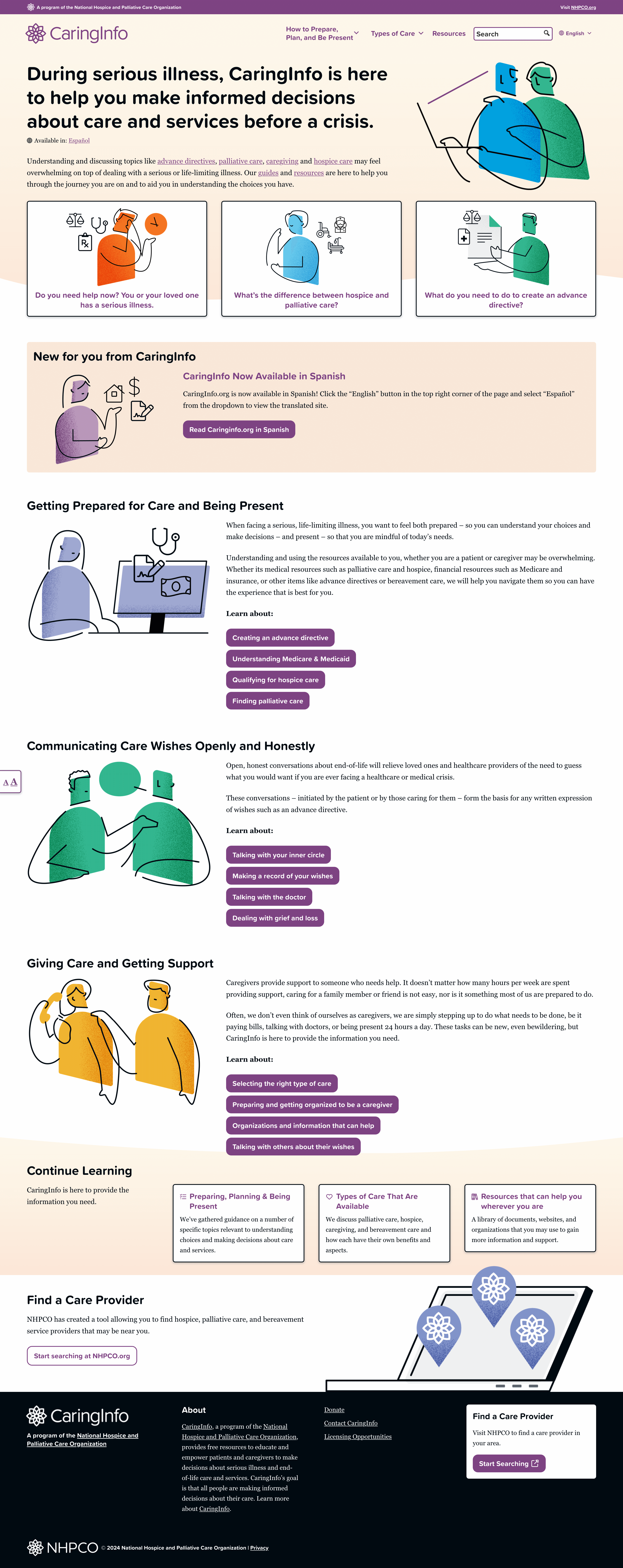
Clear typographic hierarchy, color guiding the eye, and imagery used to support content rather than dominate a page help readers settle in as they navigate the site. The color palette and font choices pull from NHPCO’s existing brand, but we added the ‘sunset gradient’ to add a warm tone to the site that creates the calming space we want to be known for.
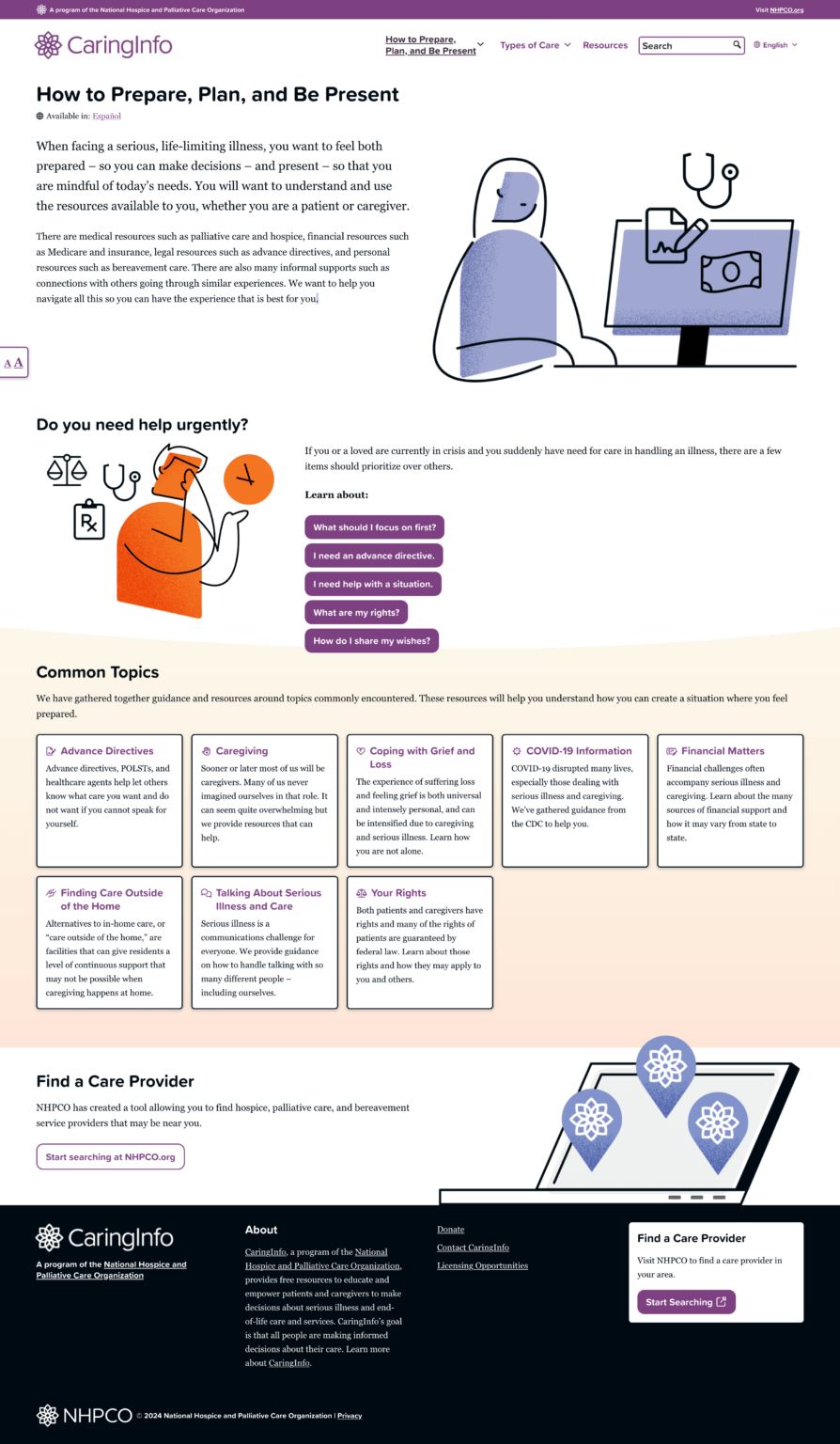
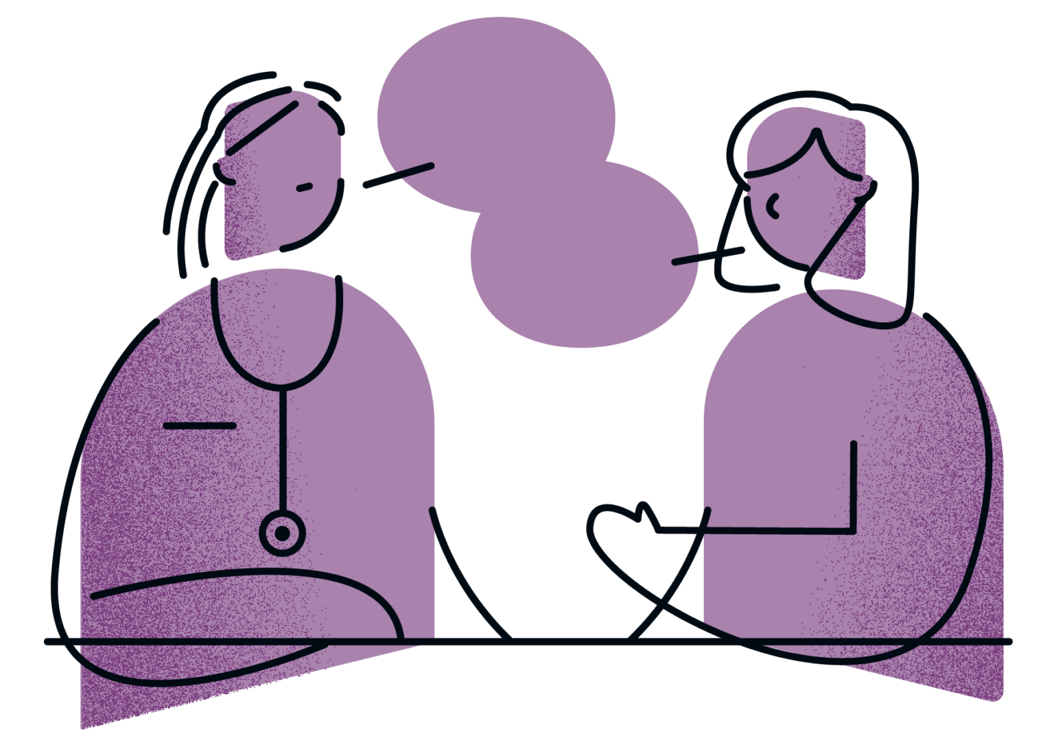
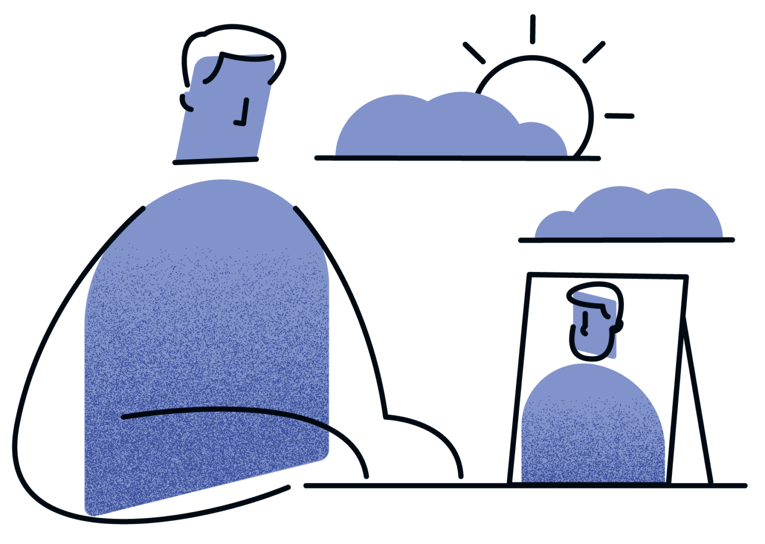
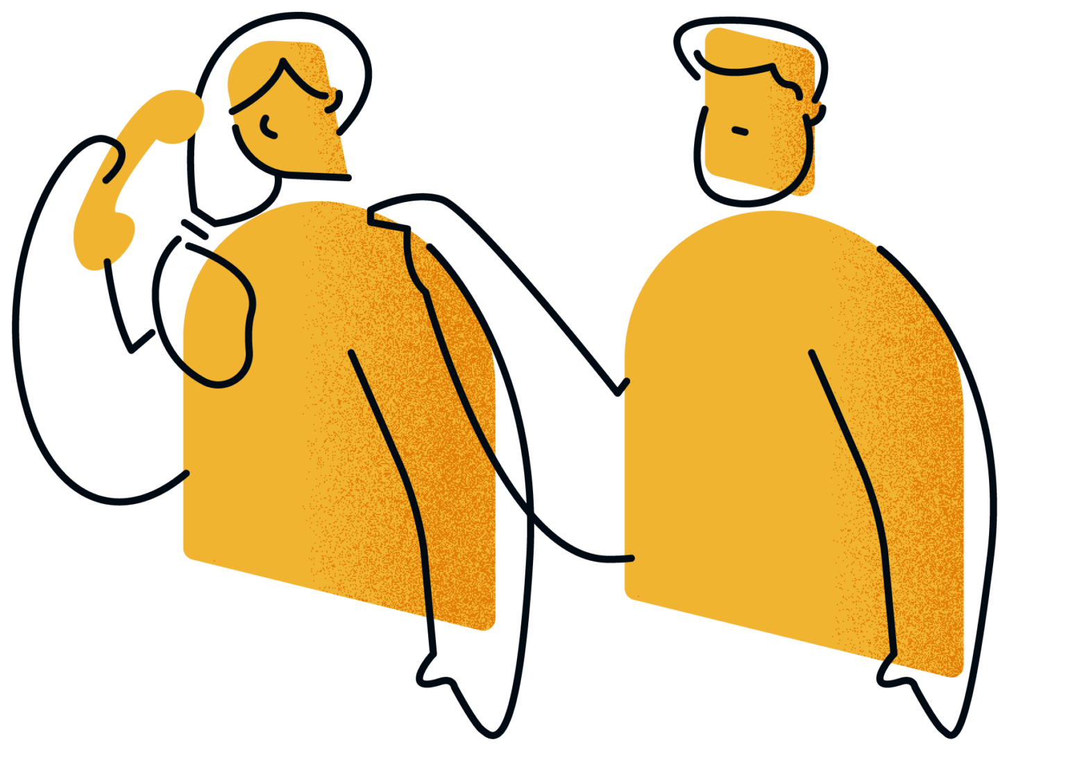
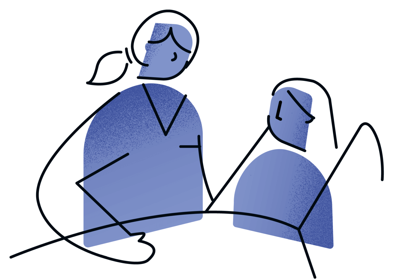
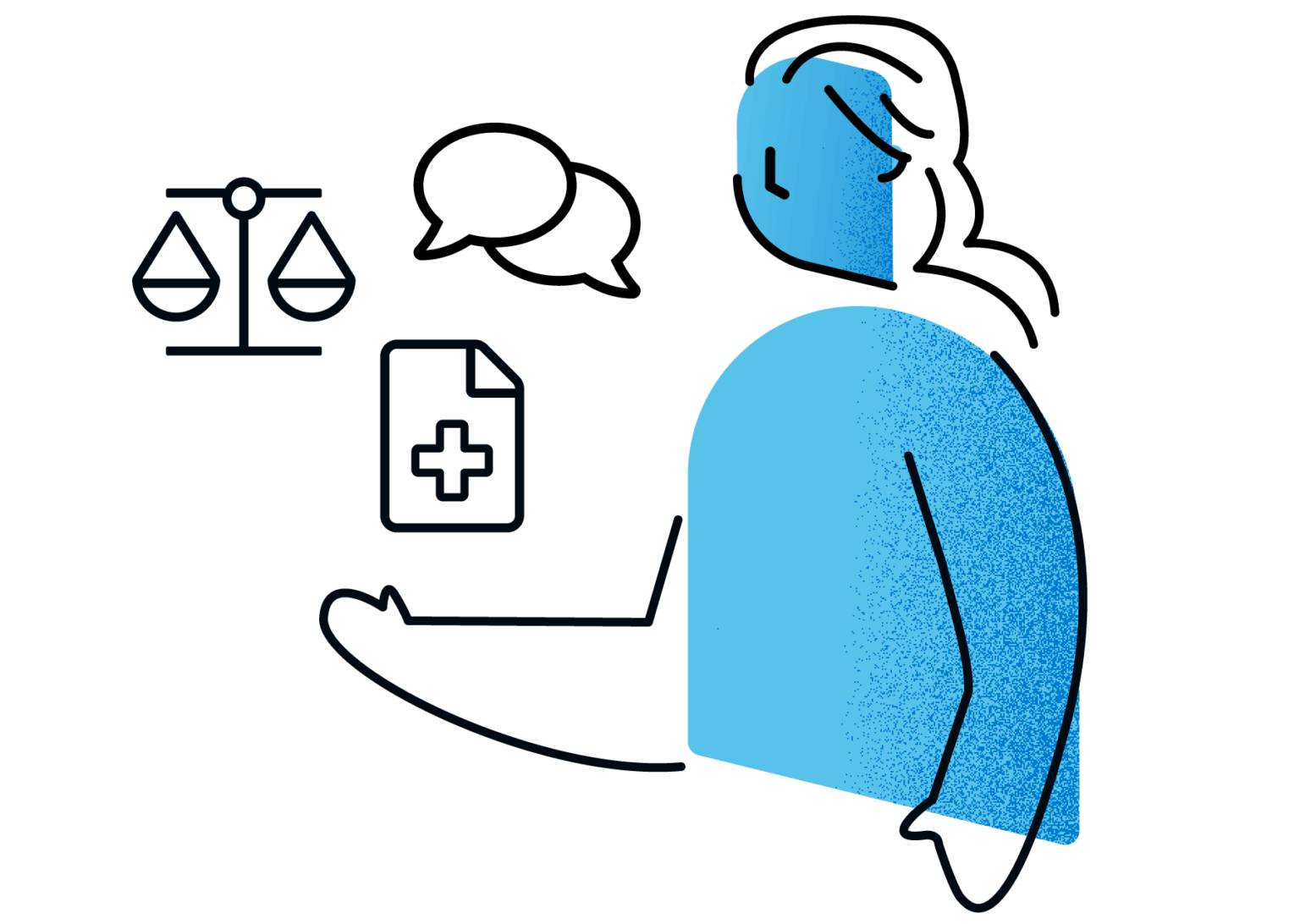
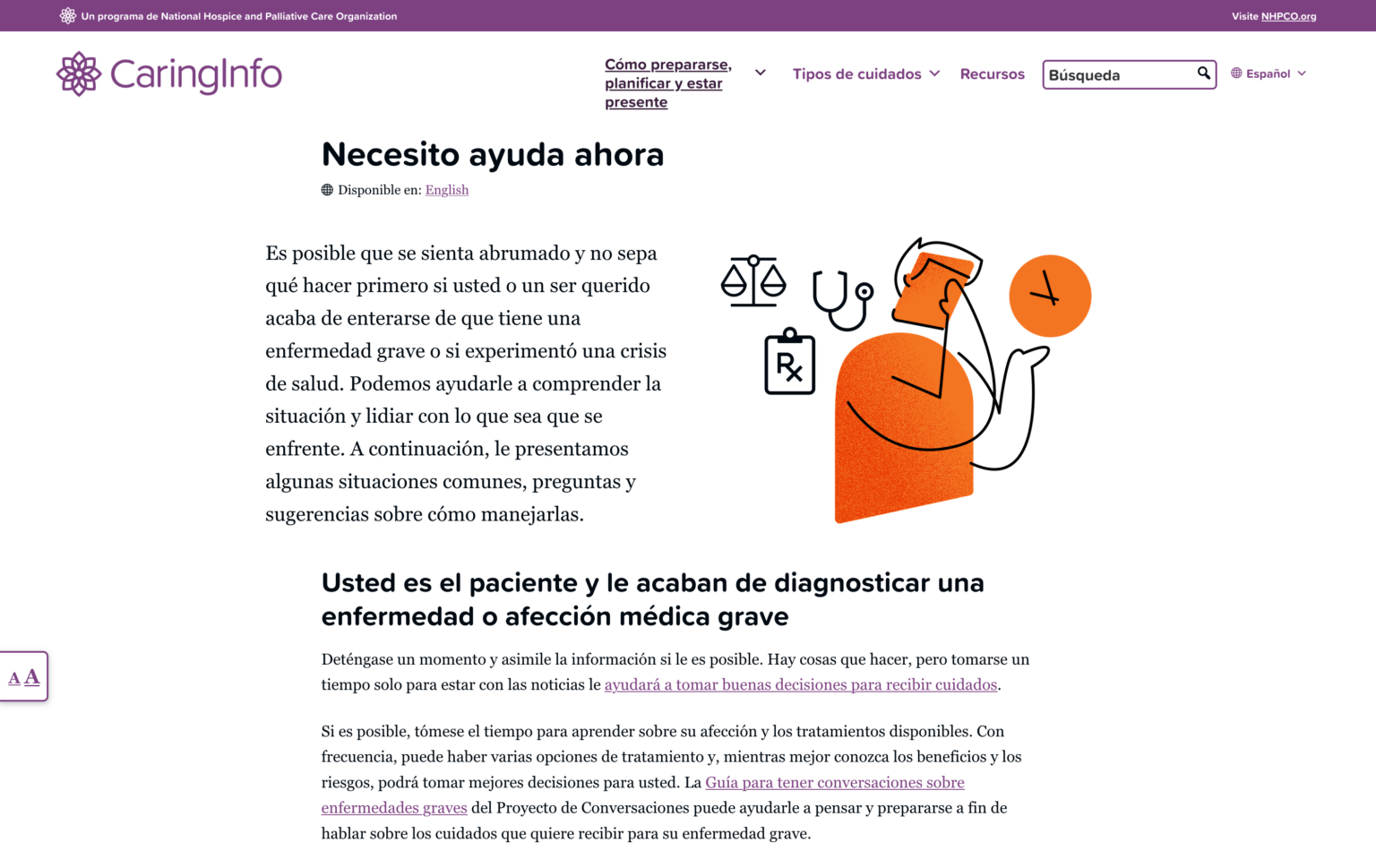
Welcome everyone looking for information through illustration
The program wanted to use illustrations rather than photos when discussing concepts so that we avoided familiar health-focused website imagery: many pictures of doctors talking to smiling patients in a bed or seated position. However, the budget didn’t have room for an ongoing set of completely custom illustrations.
The team at Get Illustrations released a pack of stock illustrations with a commercial license for modification, and through moodboard exploration, we found that they would be a good starting place for our work. We built a library of assets and use that create variations unique to the CaringInfo brand that met the program’s goals and wishes. Adding pops of color brings a sense of brightness to what can traditionally be a foreboding subject matter.

Continuing to support the needs of those coping with serious illness
Our subject matter necessitates growth and regular reviews. New resources will appear that we want to vet and share with people, and we want to be sure we are constantly working to address the entire ecosystem of needs caregivers and their loved ones have.
After the initial launch of CaringInfo, we implemented an ongoing project plan that utilizes Asana and bi-weekly team meetings to map out features, content, and improvements to the site. Changes can range from new content sections in our Planning area to more extensive efforts like launching a Spanish-language version of CaringInfo.org.
Translating content for all our audience members
The CaringInfo user experience and user interface decisions were also made with an eye towards translation. Translating content comes with it own set of needs and challenges, and we didn’t want design decisions adding unnecessary difficulties. For example, extra characters will be often be added to navigation labels, headings, and other text-based items so we wanted to make sure our layouts accounted for that.
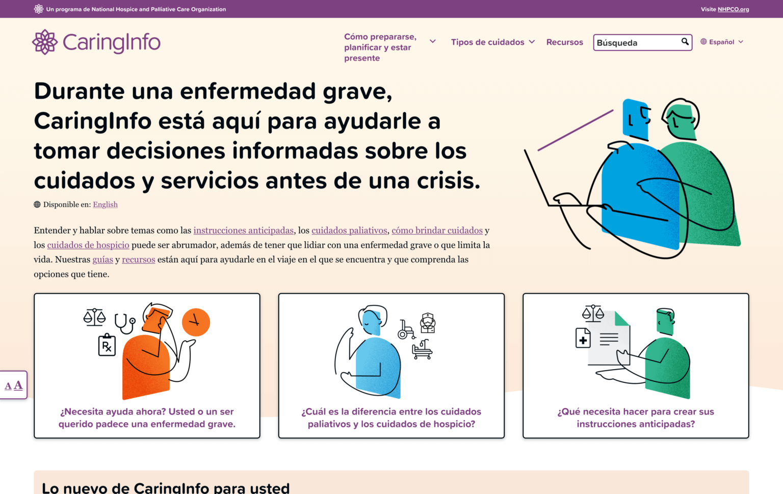
Alboum, a translation agency for non-profits, worked with us to translate all of the content on CaringInfo.org. Using a team to translate our content means we can properly respect cultural needs when discussing illness and end-of-life care and ensure that the content is the quality our audiences deserve. We use WPML, an established WordPress translation plugin, to properly manage and tailor translated content.
The design and content strategy the team put together for CaringInfo has helped many people. We have consistent month-over-month user session growth on caringinfo.org and are continuing to find new ways to help the population plan for caregiving.
We will all need to address caregiving at some point in our lives, and we cherish the trust NHPCO has put in us to help so many people. It’s important to remember that substance over style is the way to meet the needs of any audience, especially those that CaringInfo serves.