After seeing our work for Devil Tree Films, Running Woman Productions approached us to help create a logo that reflected the driving and leading spirit of the company.
Award-winning director and producer Ryan Cunningham is known for her work on Rocketkoi favorite Broad City as well as work with Alan Cumming, Tracy Morgan, and other great voices. We knew right away we wanted to create a logo that matched her energy, and a process centered around fun conversations over ZOOM landed us in a great place.
Services provided
- Branding Strategy
- Collateral Design
- Logo Design
Running the relay of creating a new brand together
Our work started with two sources of inspiration: an ionograph of Running Woman Productions’ owner and president Ryan Cunningham by photographer Jill Greenberg and our kickoff conversation. Running Woman Productions is here to create a more interesting and diverse range of programming from creative voices that are often kept from being heard, so the identity needed the energy to match that goal. Working together as fully integrated team was the only way we’d be successful.
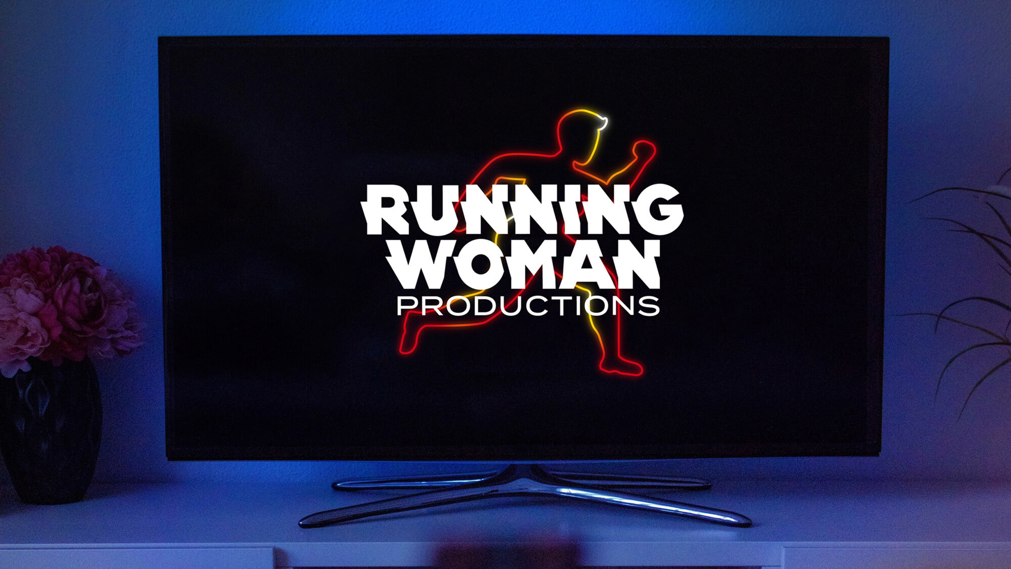
We worked through various sketches – from the abstract to the literal – before the team agreed that a running figure met the brief. Simple ideas work as long as they feel ownable at the end. By designing the runner after Ryan’s running and stylistic sense, we all made it clear that this runner belongs to Running Woman Productions. The neon style of line gave us the motion we wanted, and leads itself to animation when place added as a title card.
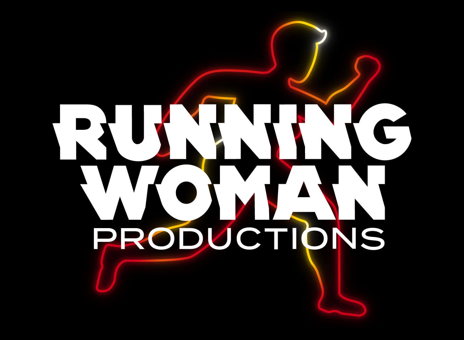
Our conversations with Ryan let us know we had an opportunity for bold typography. Early in the process, we explored typographic sketches – just black and white versions of the words Running Woman Productions – to find what best complimented the implied motion in the name. We used a slightly modified version of Kern Club’s Radio Sans, which helps the piece feel like it’s driving forward.
Stumbling at the turn
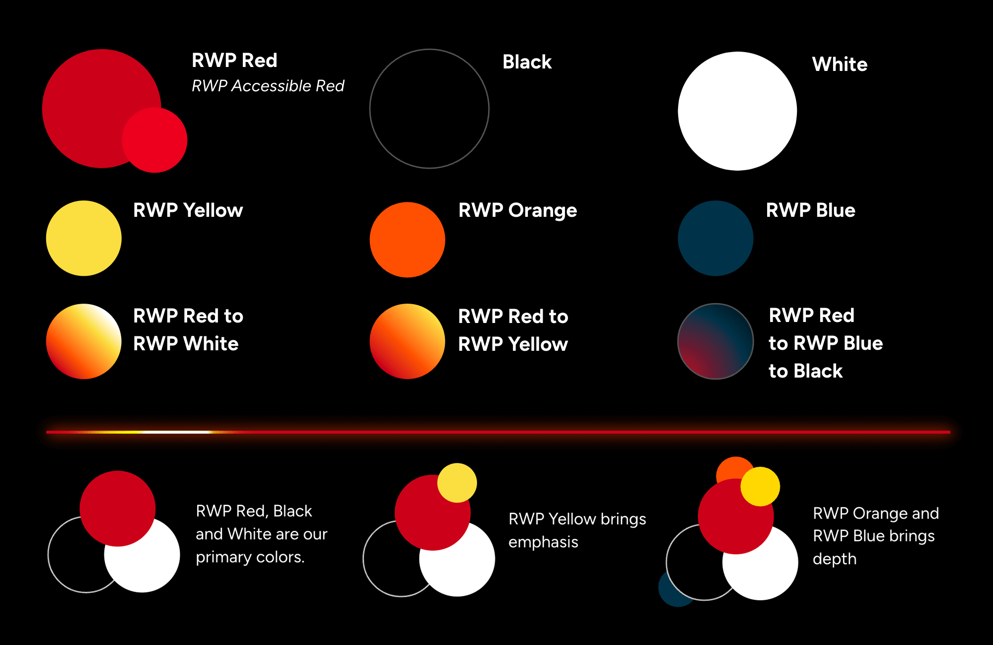
The palette took a bit longer, though. Using heat-inspired colors adapted from Greenberg’s photograph as our starting place, we worked through nearly 20 shades of red to find the right one. Everything felt either too muted or magenta, portraying the wrong tone.
Lava and lipstick became our additional points of reference and gave us a palette that felt vibrant, warm, and correct. Using red in text can lead to accessibility issues due to color contrast levels, so we supplied a specific red that felt on brand but should only be used for text on dark backgrounds.
Ensuring Running Woman Productions is ready for the next race
As with all our projects, we don’t just create a logo and leave. We want to be sure our clients have collateral they can use to help get their jobs done. Running Woman Productions makes pitch decks for various projects, so we focused on a custom Google Slide deck and business cards matching the brand.
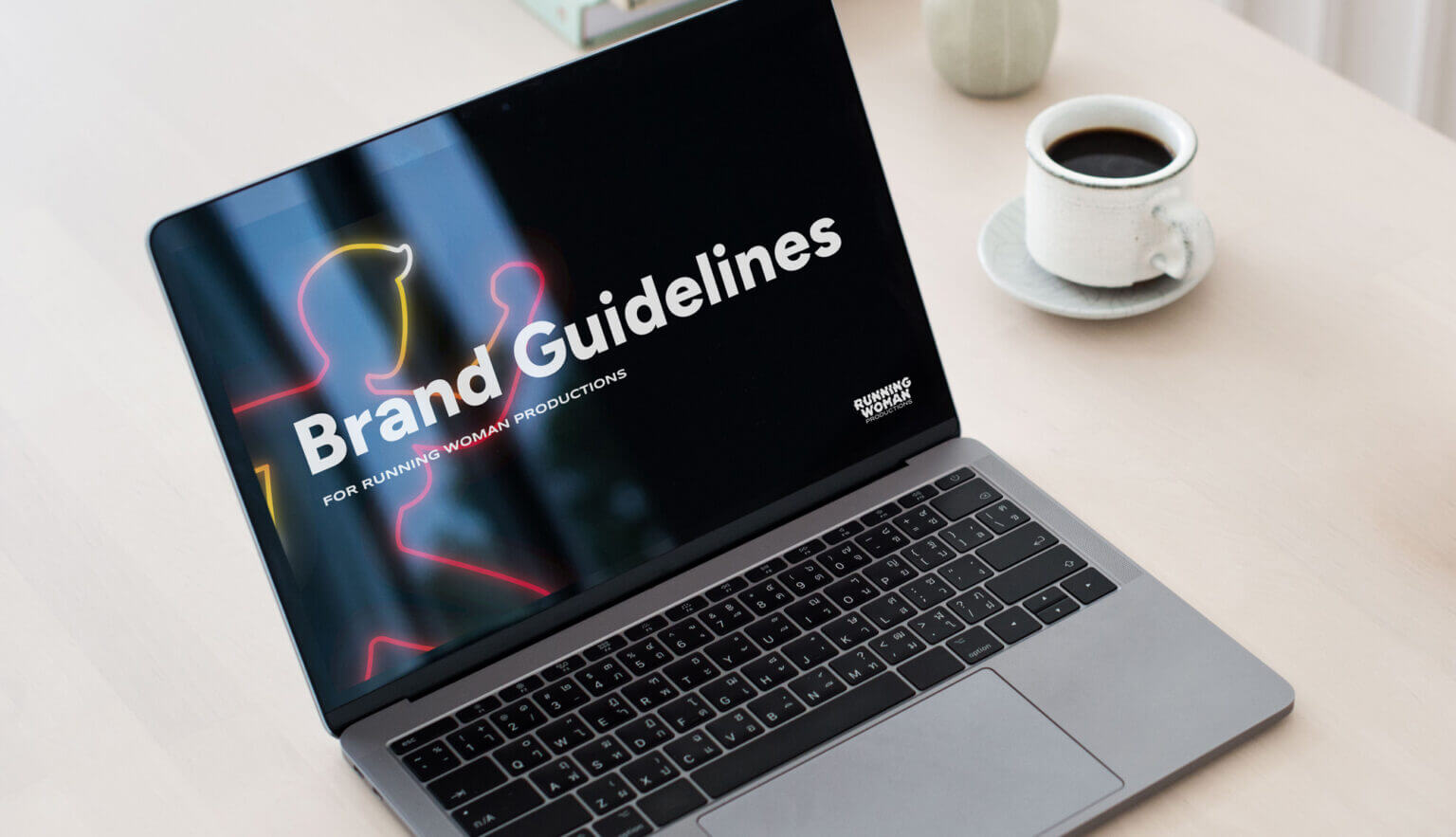
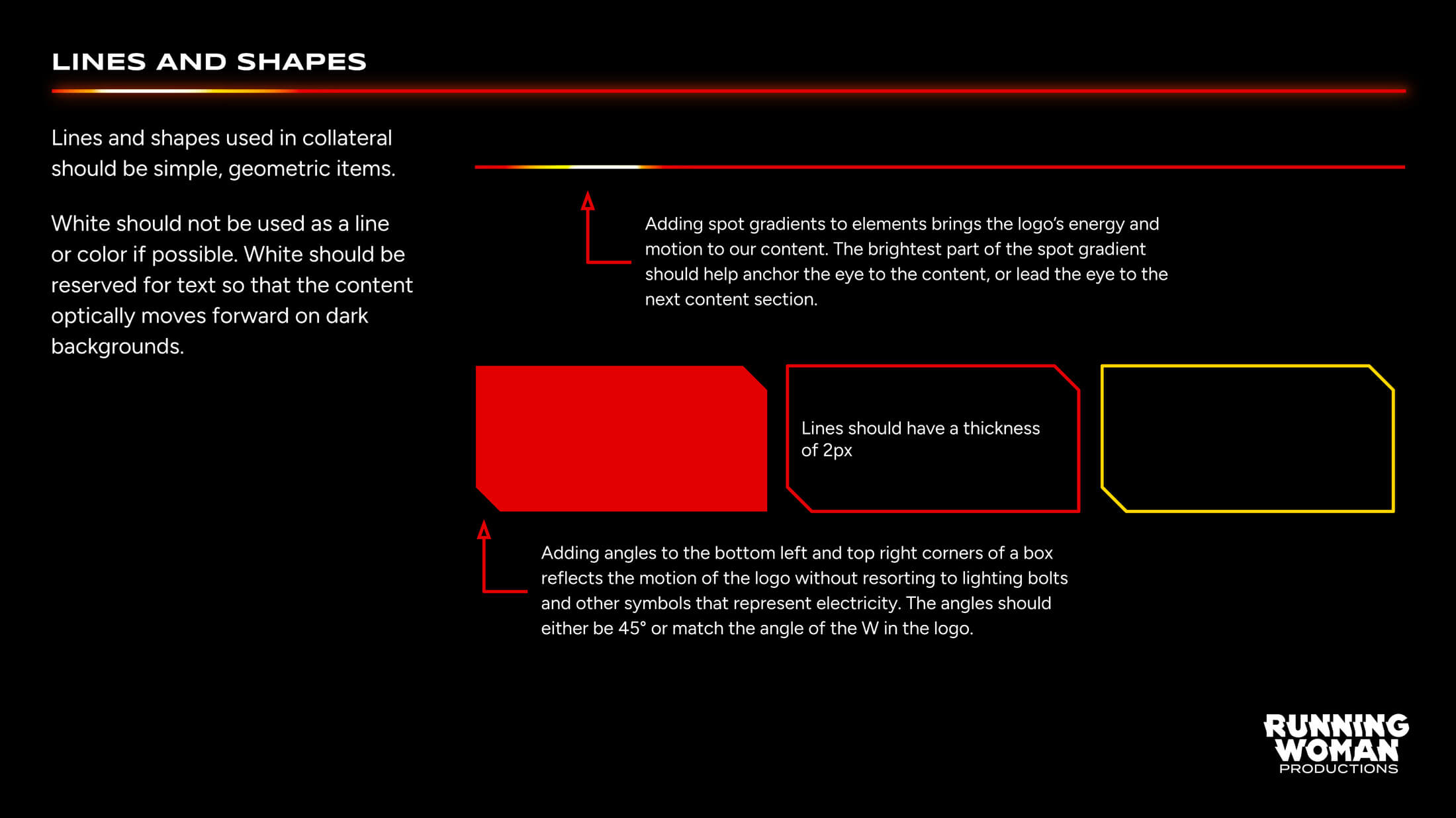
We always create brand guidelines so that our clients can create additional collateral as needed and not always have to rely on us. We had fun using Google Slides to create the guidelines so Running Woman Productions could quickly get the pieces they needed. These guidelines also serve as proof of concept for putting the brand into action!
The process with Running Woman Productions was conversational, focused, and full of understanding on what it takes to get a good logo done. It’s how all branding projects should go and we can’t wait to see the identity at the start of a show.

