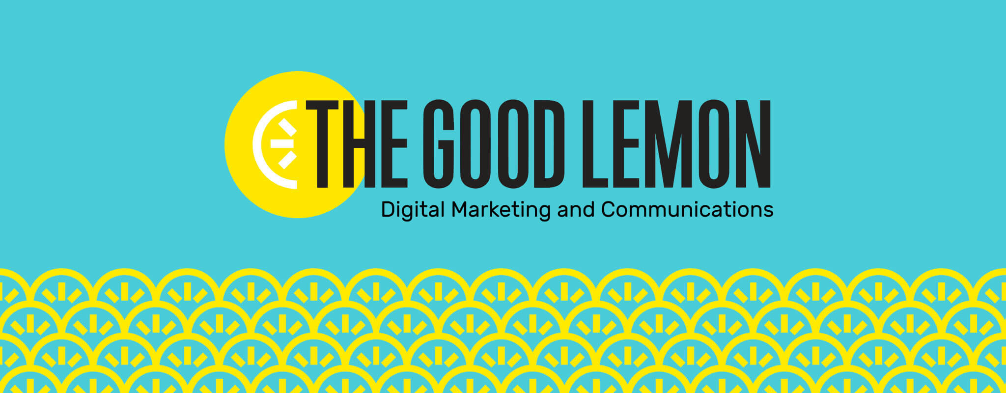
The Good Lemon, a Washington, D.C. based digital marketing and communications agency, needed a visual identity that stood out in a competitive landscape as much as their services do.
We worked closely with founder Katie Stanton to design a logo that showcased the strength of their expertise in today’s ever-changing marketplace while also letting their mission-driven clients quickly understand their positive personality.
Katie Stanton
Founder, The Good LemonServices provided
- Branding
- Illustration
- Print Design
Squeezing Extra Goodness Out of Our Process
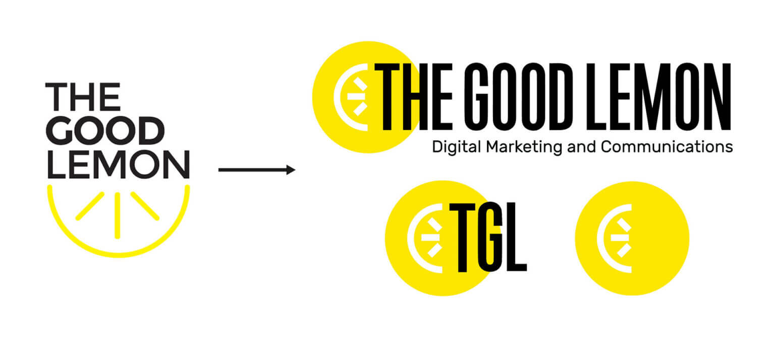
We tell the story of our branding process with the Good Lemon by starting with “Katie was clear about one thing at the beginning: She didn’t want a lemon in the logo.” Our process asks clients to embrace their biases, and there was a lot of risk in using the lemon as a key element. It could be seen as cliché or the company could be viewed as food-focused.
During our sketching round, we presented a range of ideas – including a lemon as an icon. By veering away from the literal and moving to the abstract, a lemon can serve as more then just a fruit. It symbolizes everything from a sun shining bright to the rays of a lightbulb signifying inspirational ideas to a seal of quality work.
By the end of our Discovery work, Katie looked at us and said: “I can’t believe I’m going to pick the lemon concept.”
When a brand gives you lemons, make French 75s
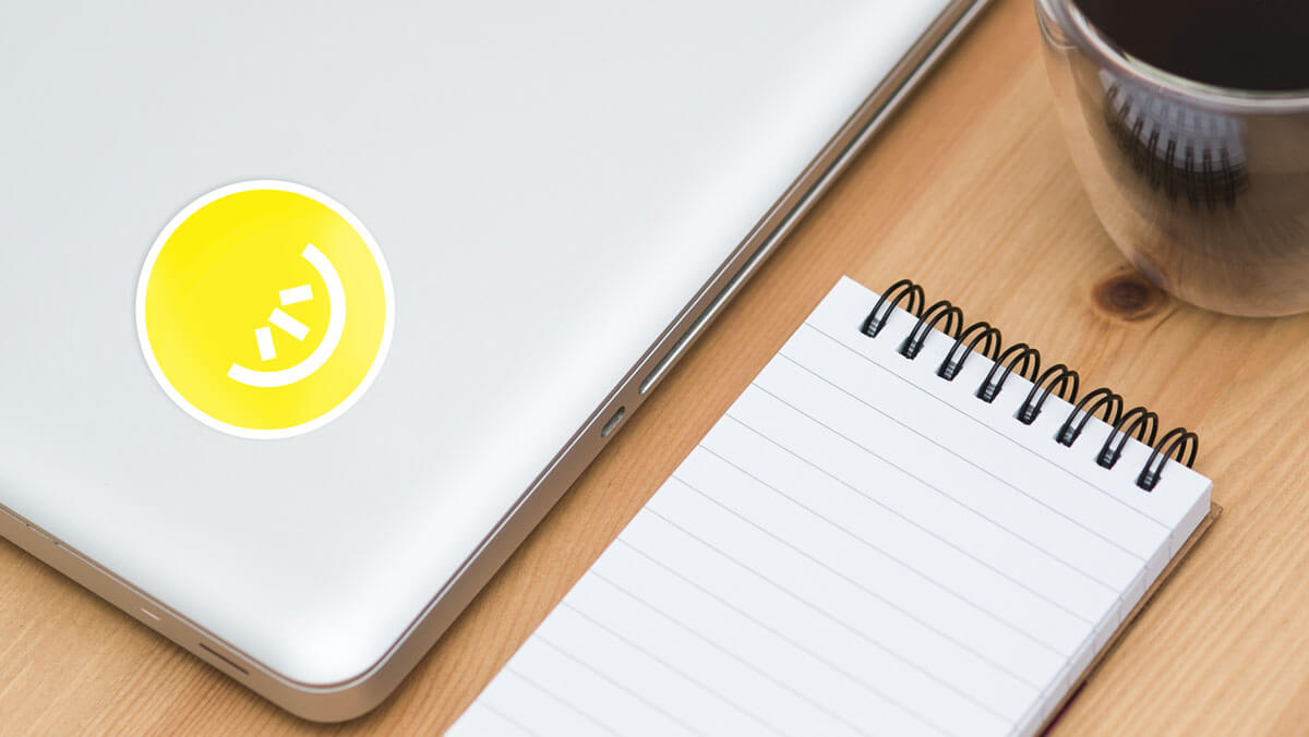
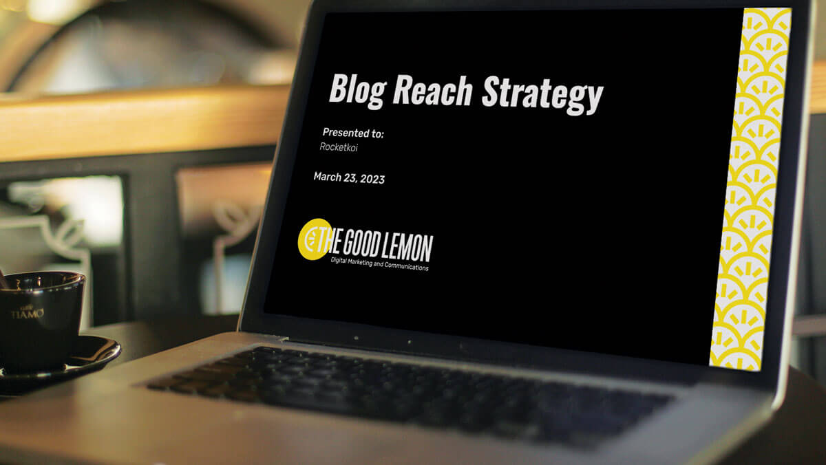
The Good Lemon team is kind, caring, playful, and curious. The brightness of the palette and simplicity of the lemon mark lets us bring the company’s tone to all of their collateral.

Our process helped bring The Good Lemon’s personality to its brand so that purpose-driven clients could immediately see what makes them unique. Alongside that, we all learned that we can offer complimentary services to those same clients and have since worked together on multiple projects. You never know what a good discovery process will reveal!